Machine learning (ML) models are the byproducts of analyzing datasets to identify patterns, predict outcomes, or automate decision-making. While visualizing data is widely recognized in various stages of data science, visualizing ML models themselves is complex. It involves an understanding of their structure, performance, and behavior to inform decisions, often requiring specialized tools.
Here are five tools that can aid in visualizing and understanding the workings of your ML models:
- TensorBoard
TensorBoard is a popular tool for visualizing advanced ML models, especially neural networks created with TensorFlow. It supports visualizing the architecture of the model, tracking training metrics like loss and accuracy, and visualizing model weights through histograms and other graphs. TensorBoard can also visualize aspects of classical ML models built with other libraries like scikit-learn. Here is an image of TensorBoard visualizations: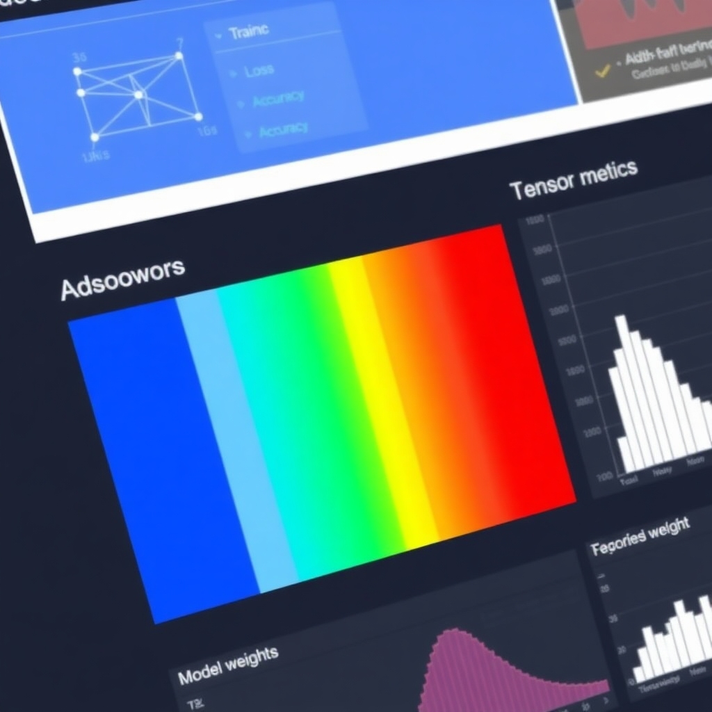
- SHAP (SHapley Additive exPlanations)
SHAP is a renowned tool within the realm of explainable AI (XAI). It visualizes how individual input features influence model predictions, providing insights into both simple and complex models. Here is an image about SHAP: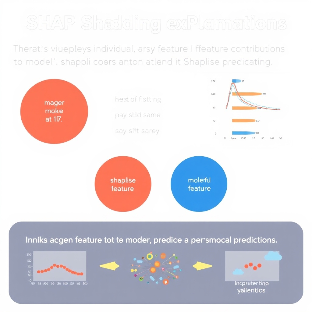
- Yellowbrick
Yellowbrick is a Python library designed for model evaluation and diagnostics. It complements scikit-learn by offering various sophisticated and customizable visualizations, such as learning curves, residual plots, and ROC curves. While powerful, it might not be as widely recognized, leading to relatively limited documentation. Here is an image of Yellowbrick: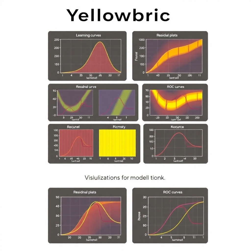
- Netron
Netron specializes in visualizing complex architectures of deep learning models, including convolutional neural networks (CNNs) and models for natural language processing (NLP). It supports various frameworks and formats like TensorFlow, PyTorch, and CoreML, making it invaluable for ML engineers needing to inspect deep neural network operations closely. Here is an image of Netron’s visualizations: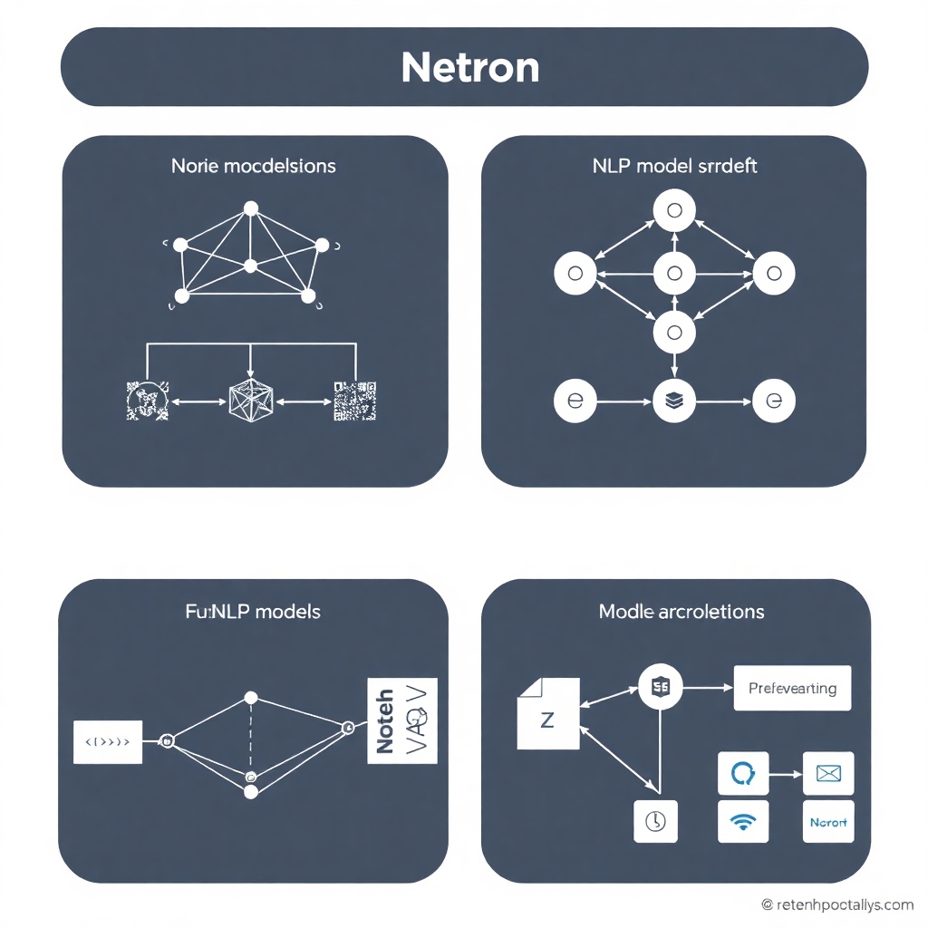
- LIME (Local Interpretable Model-agnostic Explanations)
LIME, like SHAP, provides visual explanations for individual model predictions. It does this by approximating complex models with simpler, interpretable counterparts and is compatible with both classical and deep learning models, offering insights across various techniques and algorithms. Here is a visual summary of LIME:

Conclusion
These five versatile tools offer valuable insights into visualizing machine learning models tailored to various types and scenarios. Experimenting with them can deepen your understanding of your models’ functions and predictions.
If you need any further changes or additional visuals, feel free to ask!